Kimberly-Clark Professional · 2025
ReNew.
A circular service, rebranded to be credible to the people who buy it, and honest enough not to greenwash.

The brief
Make recycling used products feel simple, and worth doing.
ReNew is Kimberly-Clark Professional’s service for taking used products and giving them another life. The proposition is strong, but circularity is a category where language runs ahead of proof, and where the buyer is a procurement team as often as a sustainability lead.
The identity had to carry a sustainability promise credibly, without the softness and vagueness that makes people stop believing it.
What I directed
A system built around one idea: used becomes new.
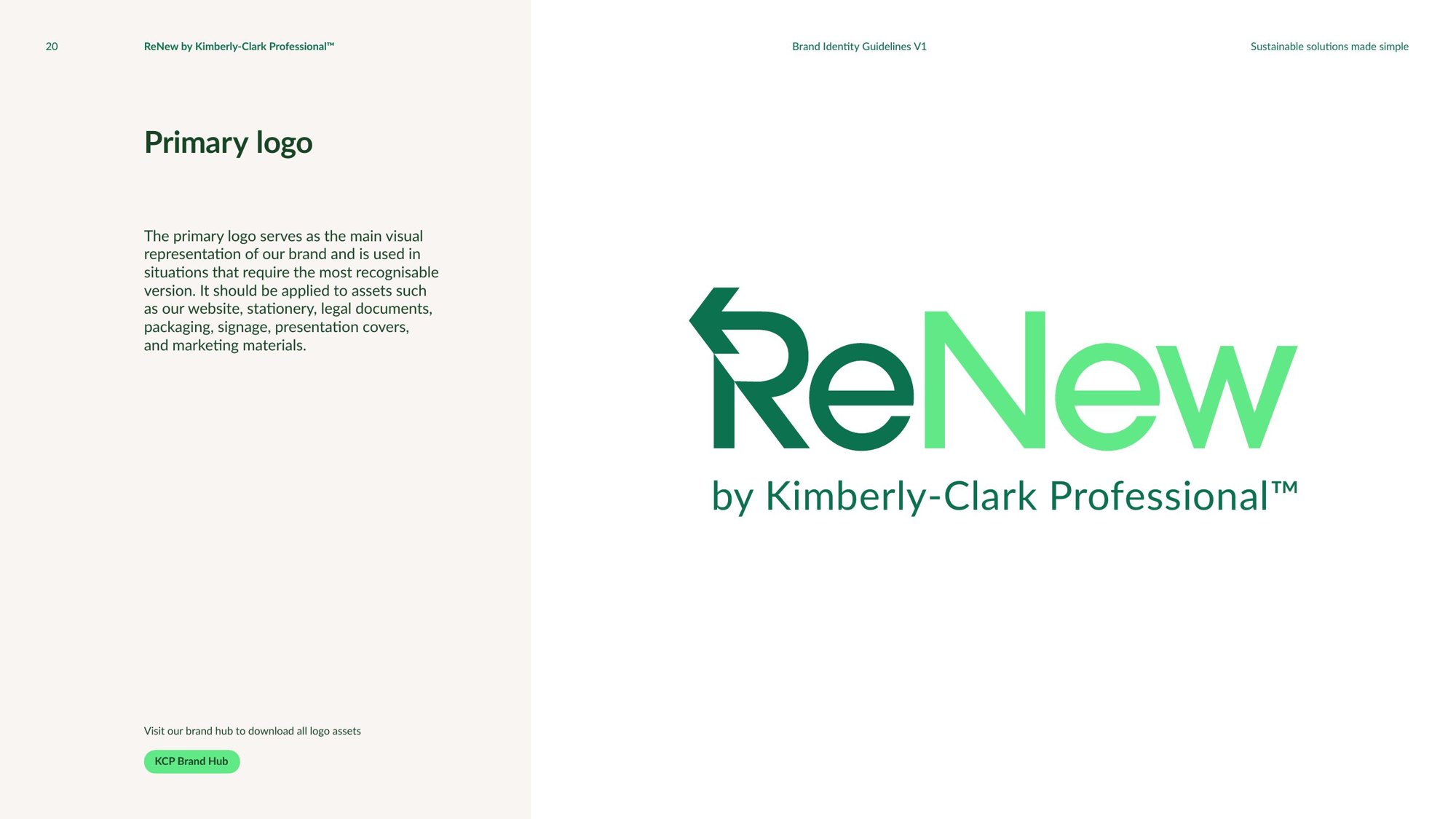
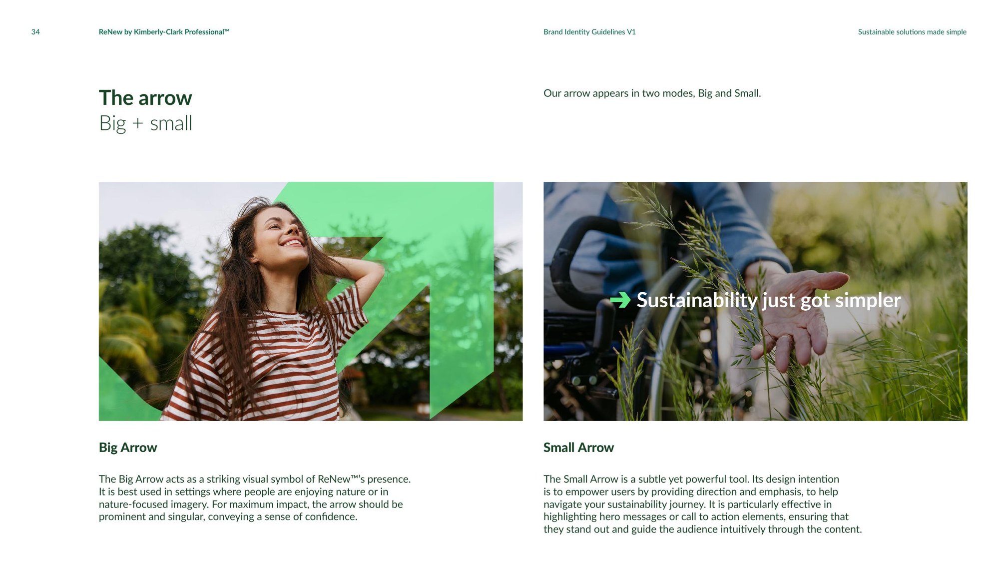
The arrow. A proprietary device built into the bowl of the R, turning at a consistent angle to signal the move from used to new. It works as a logo element, as a large graphic and as a small call-to-action marker.
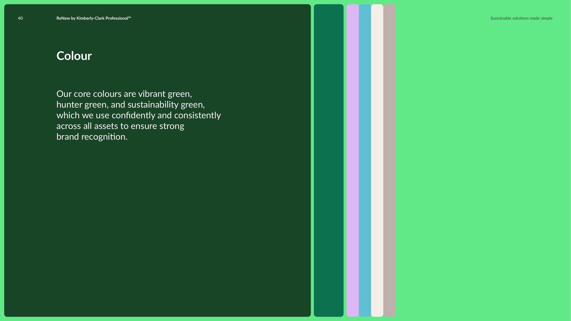
A palette from the material world. Deep hunter green, a vibrant sustainability green, navy and a lilac accent, confident rather than pastel, so the brand reads as a business service and not a campaign.
A verbal identity with discipline. Knowledgeable, caring and reassuring, written to three principles: be humble but aspirational; inform but don’t overcomplicate; make it incredible, but doable.
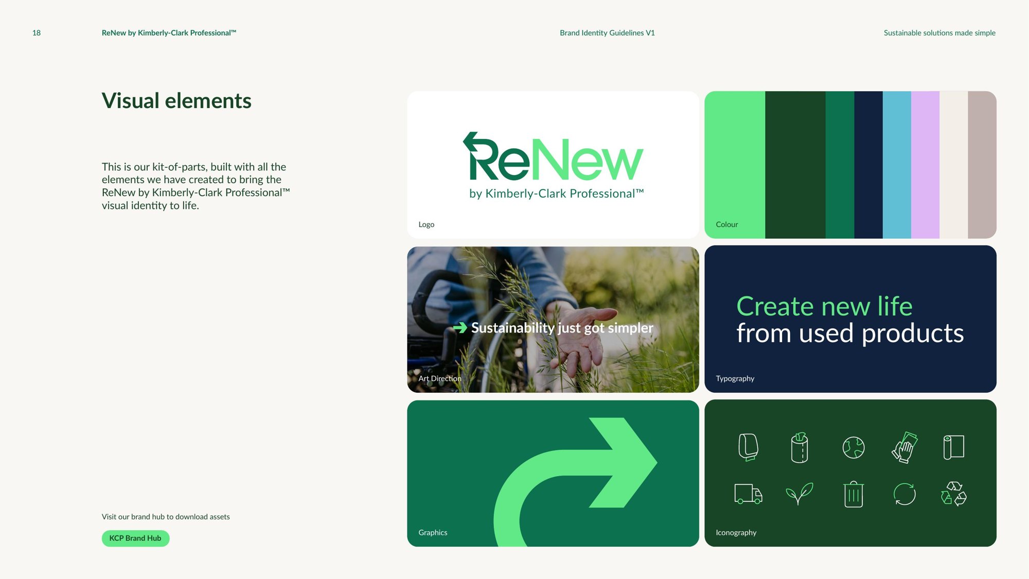
Guidelines a global network can run. Logo, colour, typography, iconography, art direction, layout and applications, documented so markets can use the system without it drifting.
Credits
Strapline: “Sustainable solutions made simple.”
All content © Kimberly-Clark Professional.
Talk to me about brand.
christievgray@gmail.comSpeaking enquiries, collaborations, and conversations about the work.