OVO Energy · 2022–2025
A bold new brand.
OVO had come through an investment round and the brand needed to grow up. We developed a new brand platform, and the identity had to match it. Wolff Olins came on as the agency; I worked with them directly on the identity, then my team built everything needed to run it.
The brief
An identity that could grow with the business.
OVO had raised investment and grown fast. The brand it had was no longer the brand it needed. We developed a new brand platform, and the visual identity had to express it and inject more energy and vibrancy into a company most people encounter through bills, apps and service messages.
The harder half of the task was operational. An energy company produces a very high volume of communication across a lot of channels. An identity that only works in a launch film doesn't survive contact with that. It needed a system a large in-house team could run at pace without the brand drifting.
What I directed
A brand world built around natural energy.
Wolff Olins came on board as the agency for the identity. I worked with them directly on it, briefing and directing the work against the platform, and it was a good partnership to work in. Natural energy became the idea at the heart of the system, and the single test we applied to anything new.
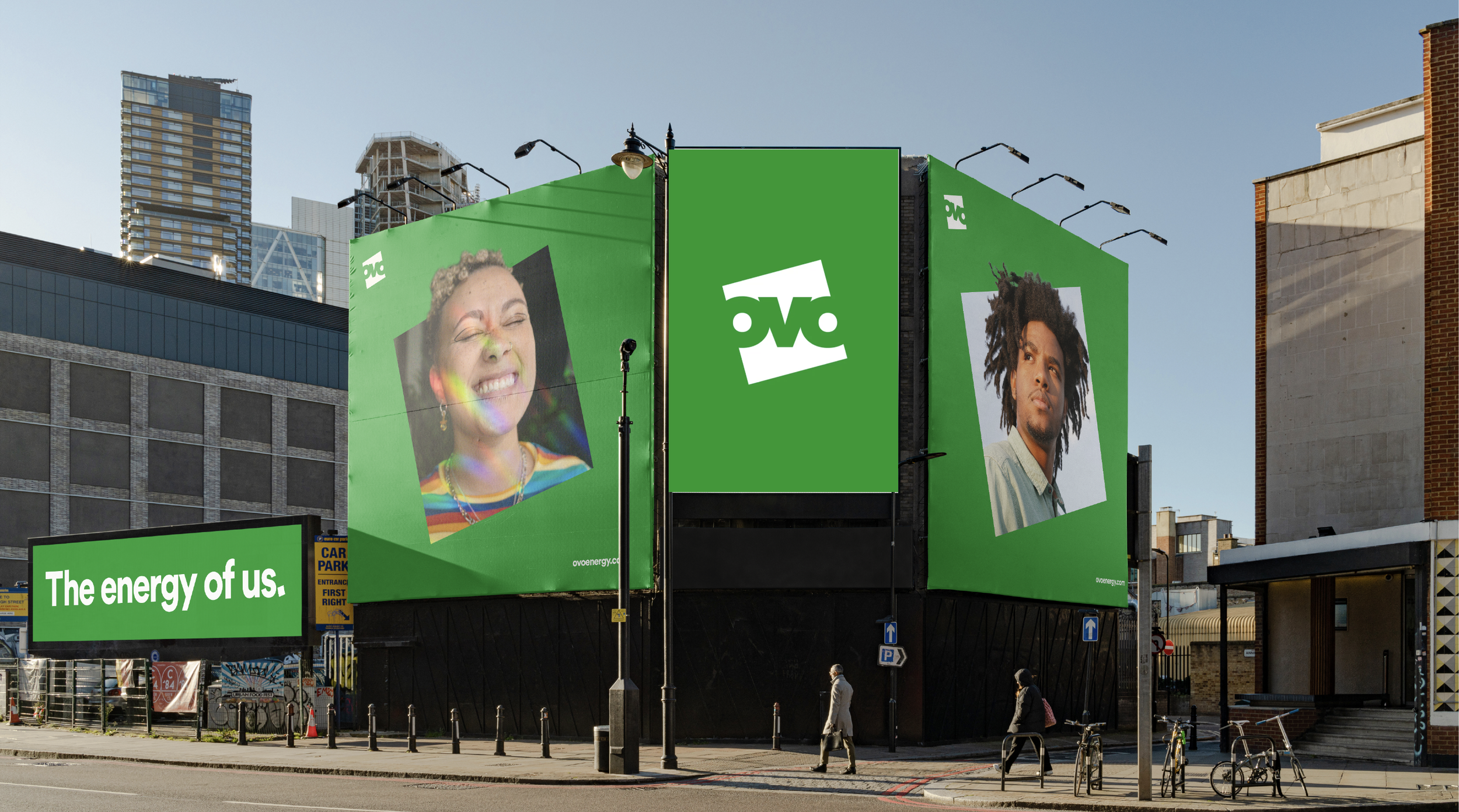
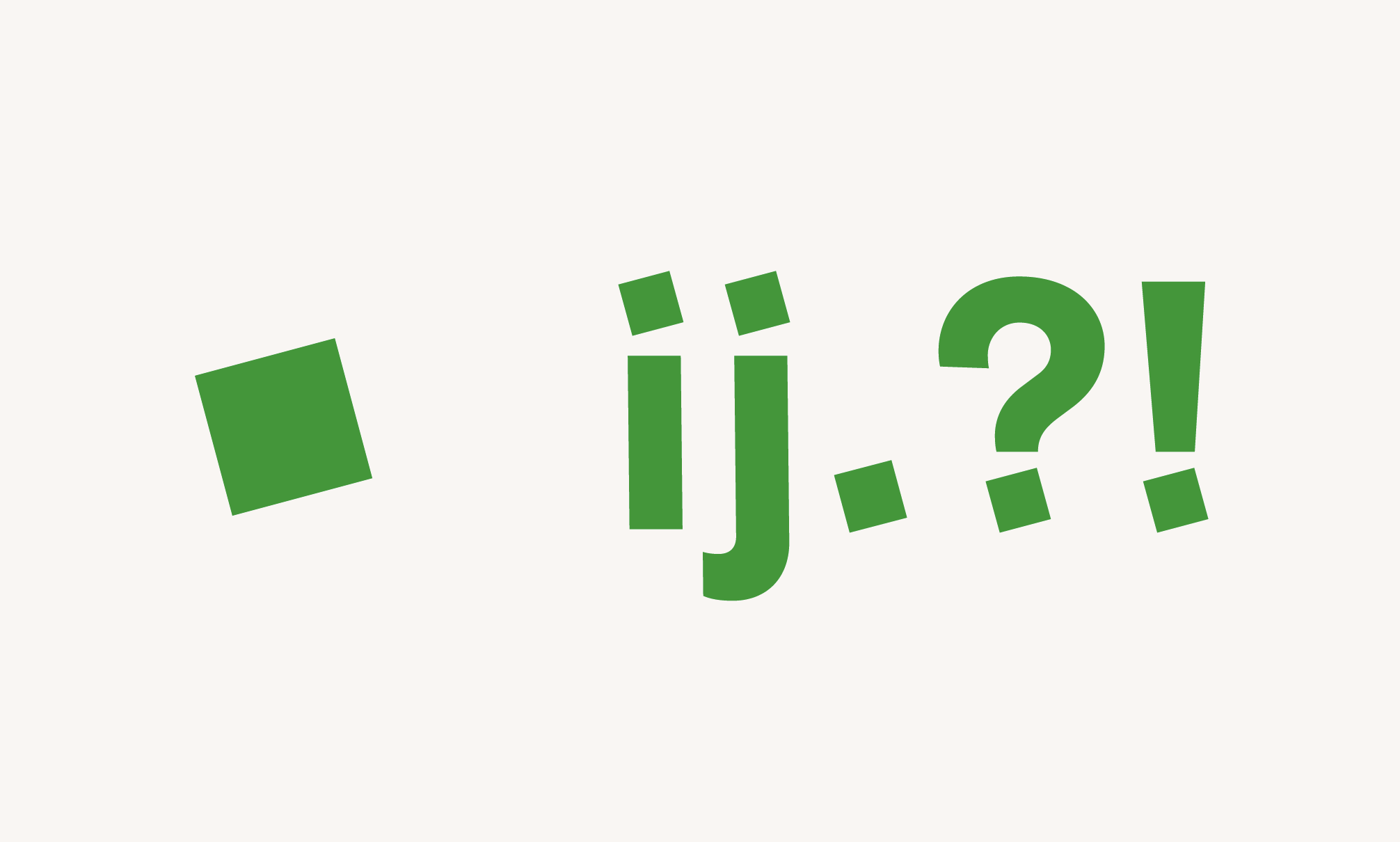
The Square, angled 15° upwards. Optimistic and always switched on. Used as a holding device to elevate products and make the way OVO shows them ownable, and pushed deliberately outside its own edges when the brand needs to be gutsy rather than tidy.
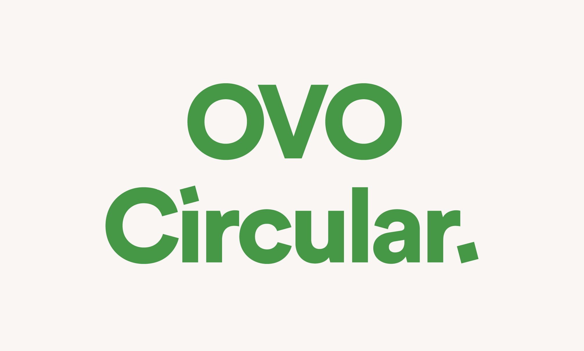
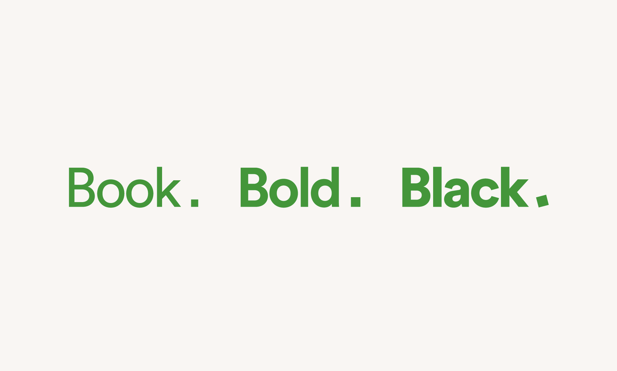
OVO Circular, a custom typeface. Born from the Square, so the type is recognisably OVO before anyone reads a word of it.
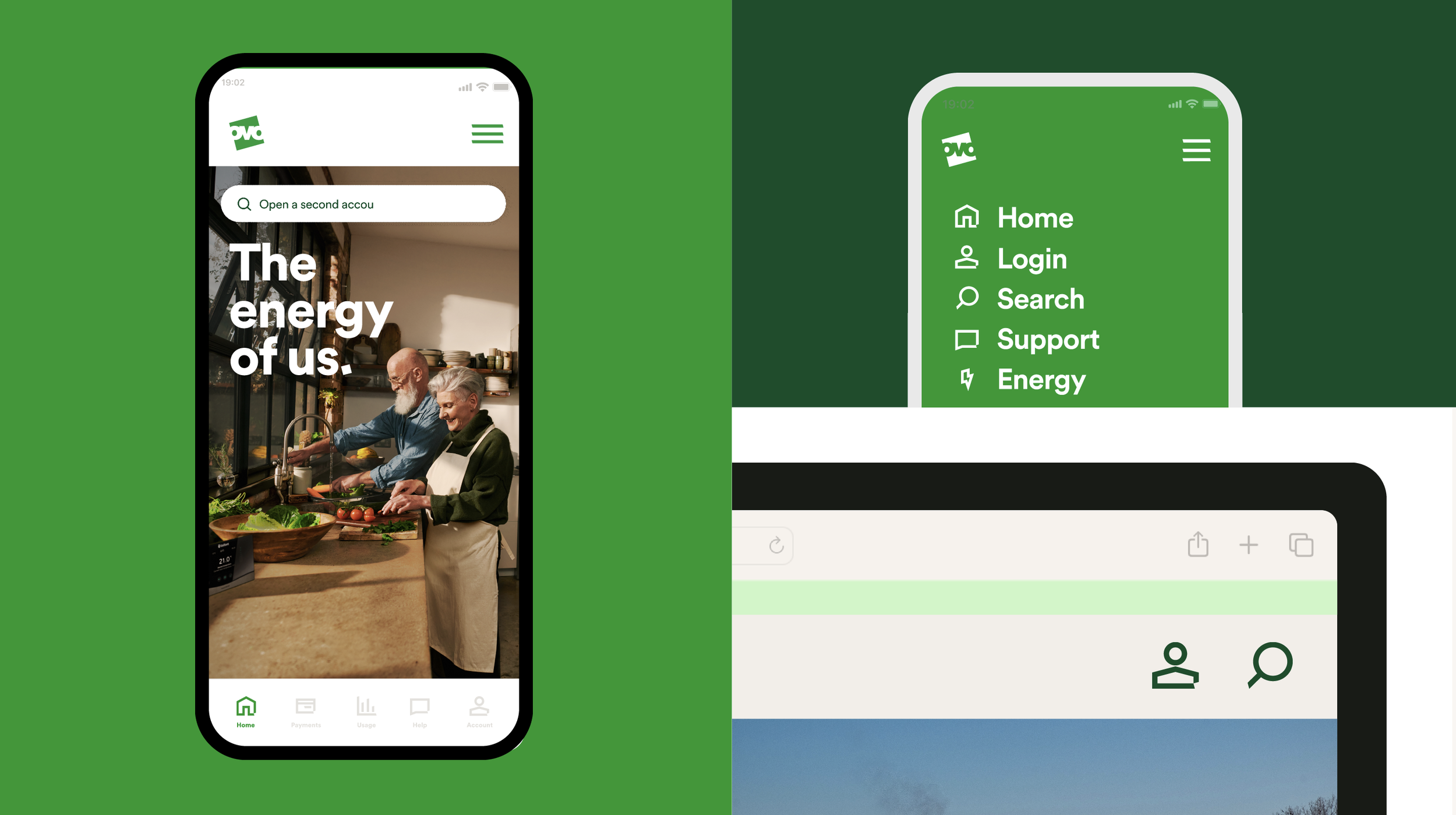
A complete icon set. Cuts taken from the Square in the stroke of each icon, so the system stays distinct at small sizes and in interface work.
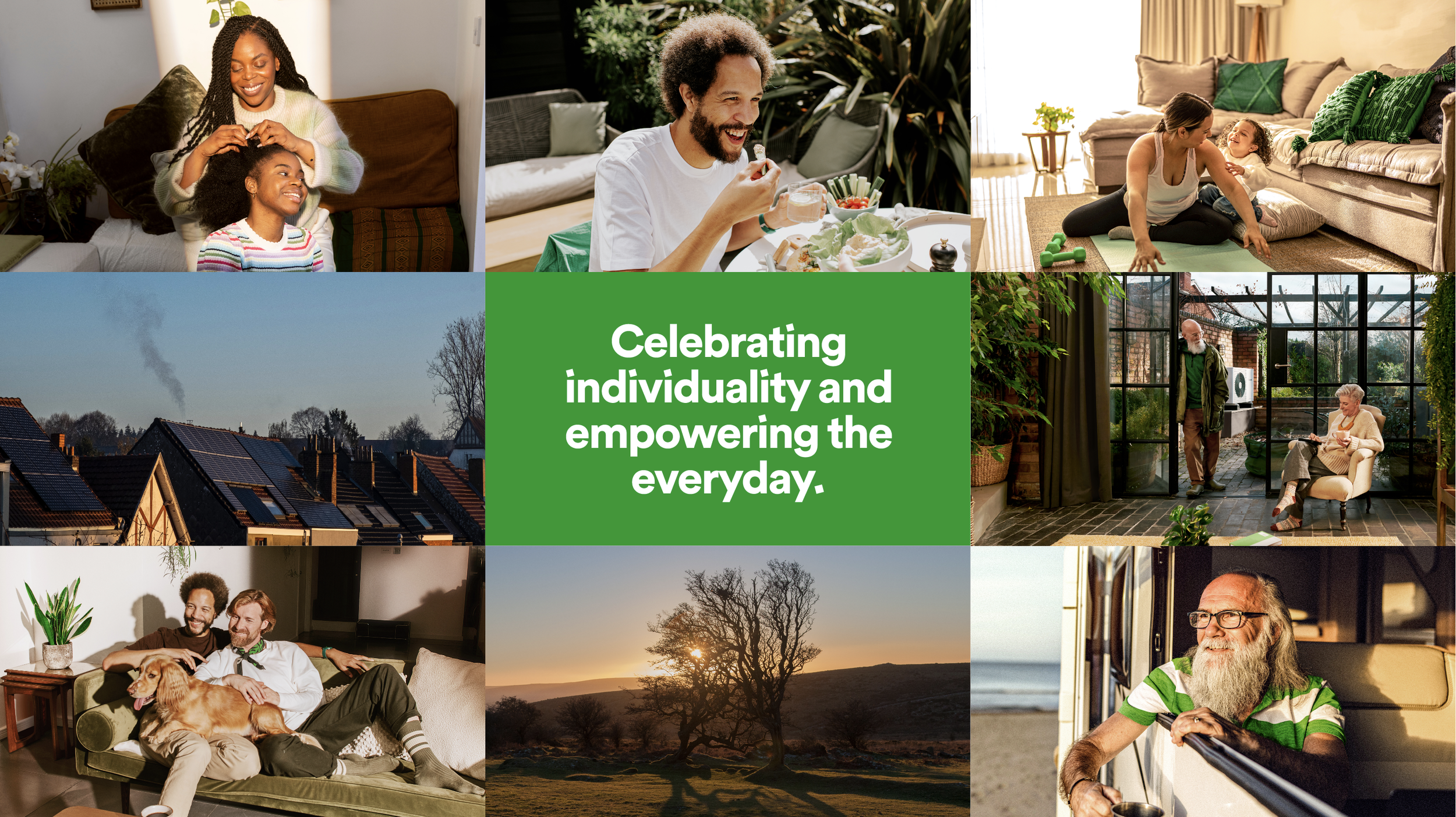
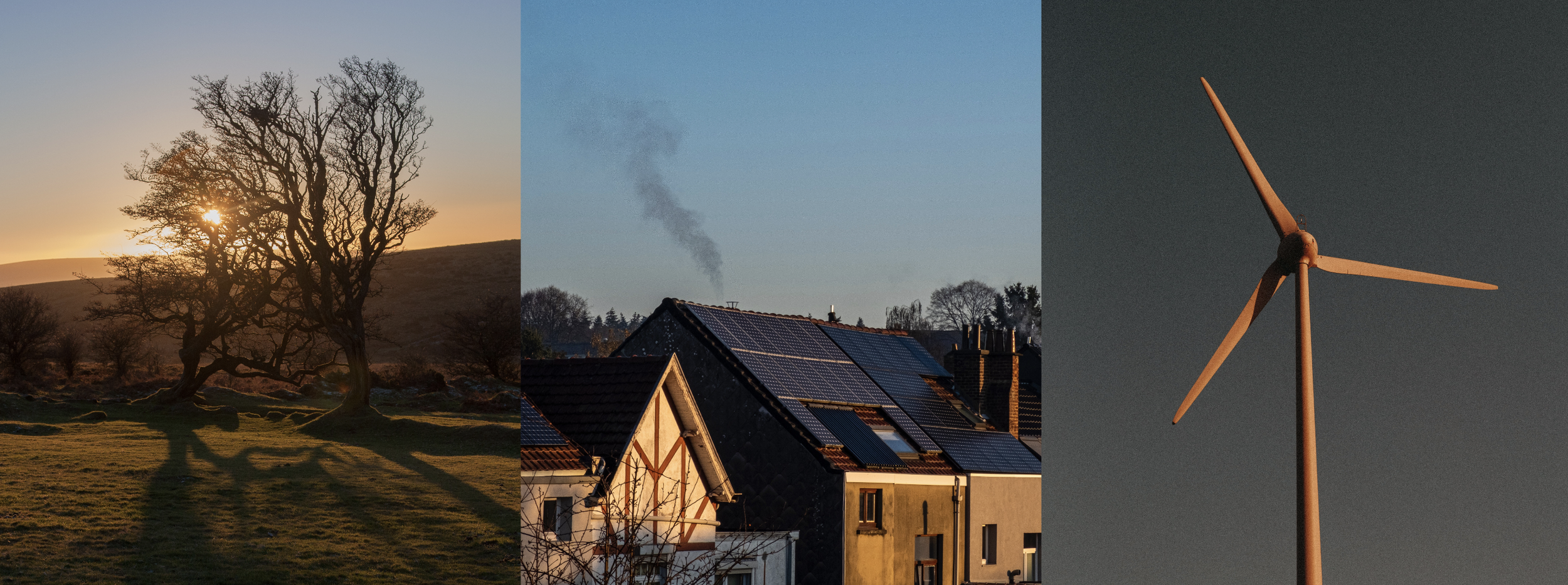
Photography and film. OVO is a people-first brand, so the direction heroes real customers and the role OVO's products play in their lives — energised by natural light, celebrating individuality rather than staging it.
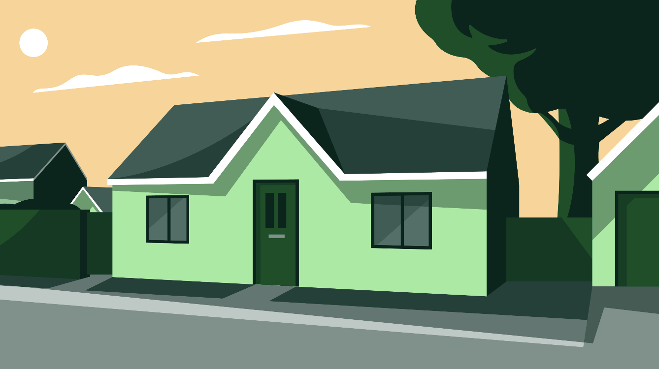
Illustration. A set built to visualise products and services, and to explain information to customers where photography can't do the job.
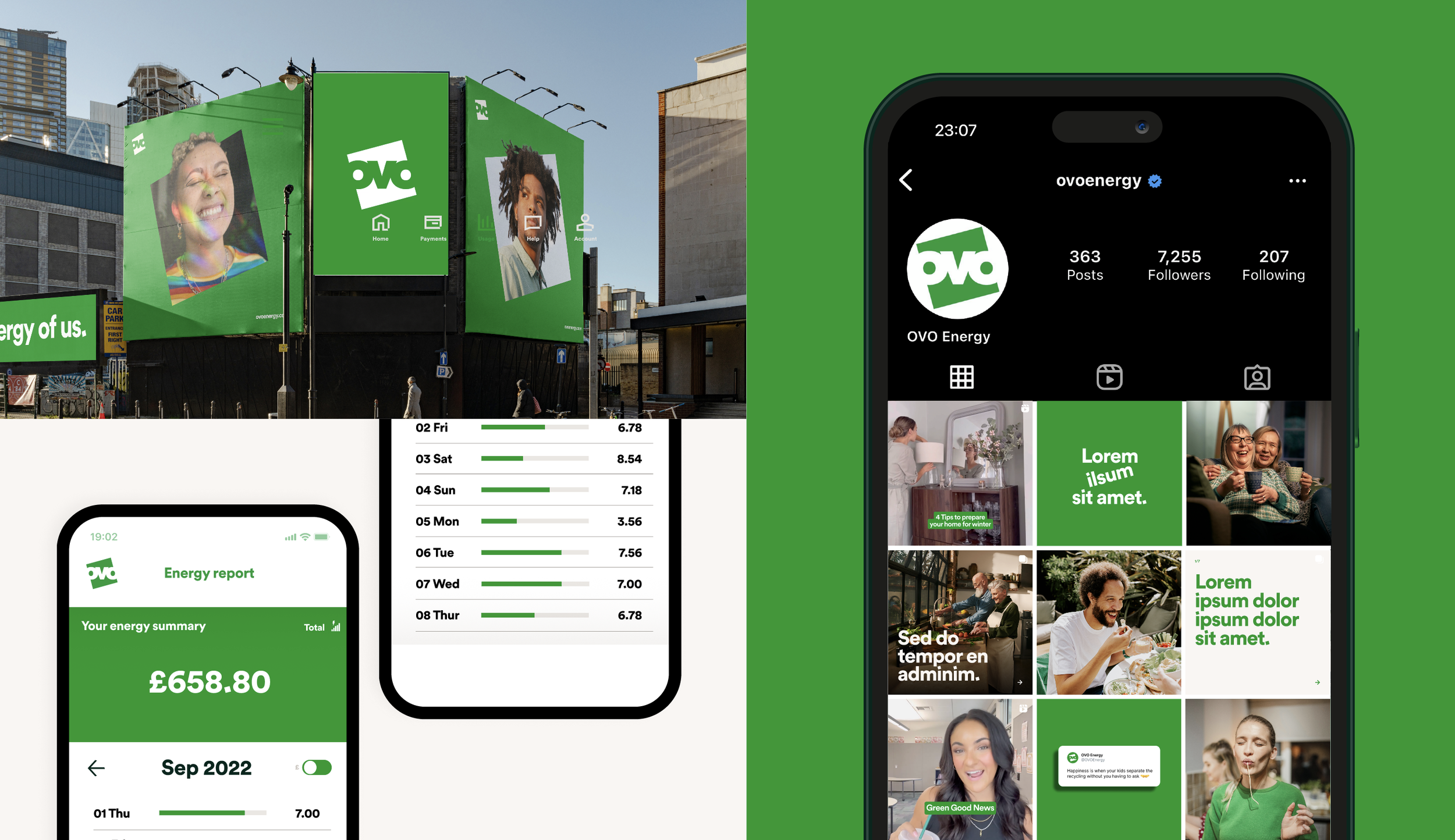
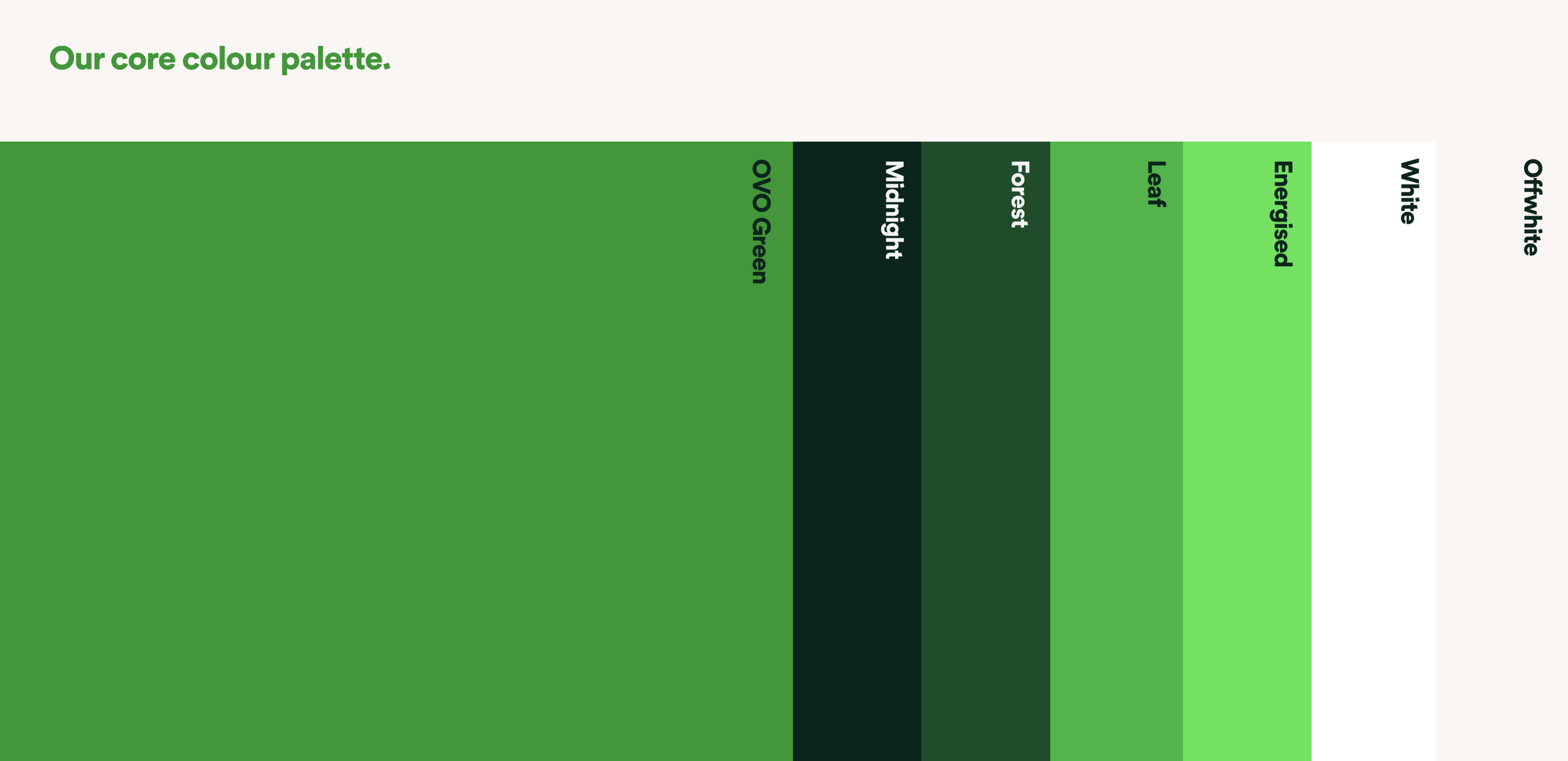
A colour palette born from nature, inspired by tech, plus UX/UI principles so the identity holds up in the app and on the web as well as on a billboard.
What happened
The system held, and so did the team.
My team and I led the rollout across every channel and market. The studio that did it was the one I built: it started with one designer supported by freelancers, and grew into an in-house team producing work that held its own against external agencies.







Credits
Identity: Wolff Olins, directed brand side by Christie Gray
Brand world and rollout: OVO in-house studio
Illustration: Sam Peel
All content © OVO Energy
Talk to me about brand.
christievgray@gmail.comSpeaking enquiries, collaborations, and conversations about the work.