Danone Nutrilon · Osborne Pike · 2021
A lens into nature.
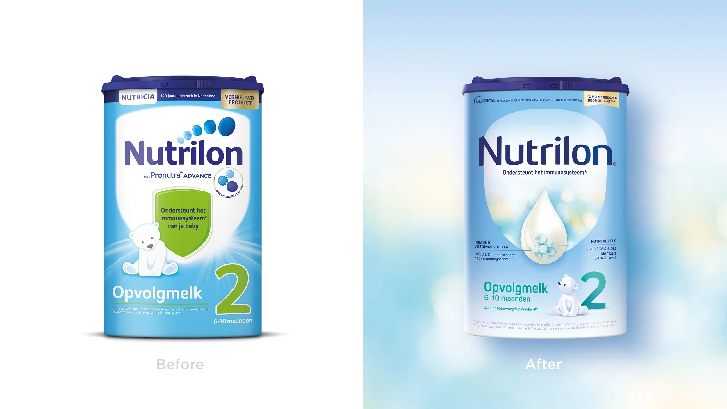
Nutrilon had authority and no warmth. The task was to keep the science and reframe it as something natural, then build a range architecture parents could actually navigate.

The brief
Keep the authority. Lose the laboratory.
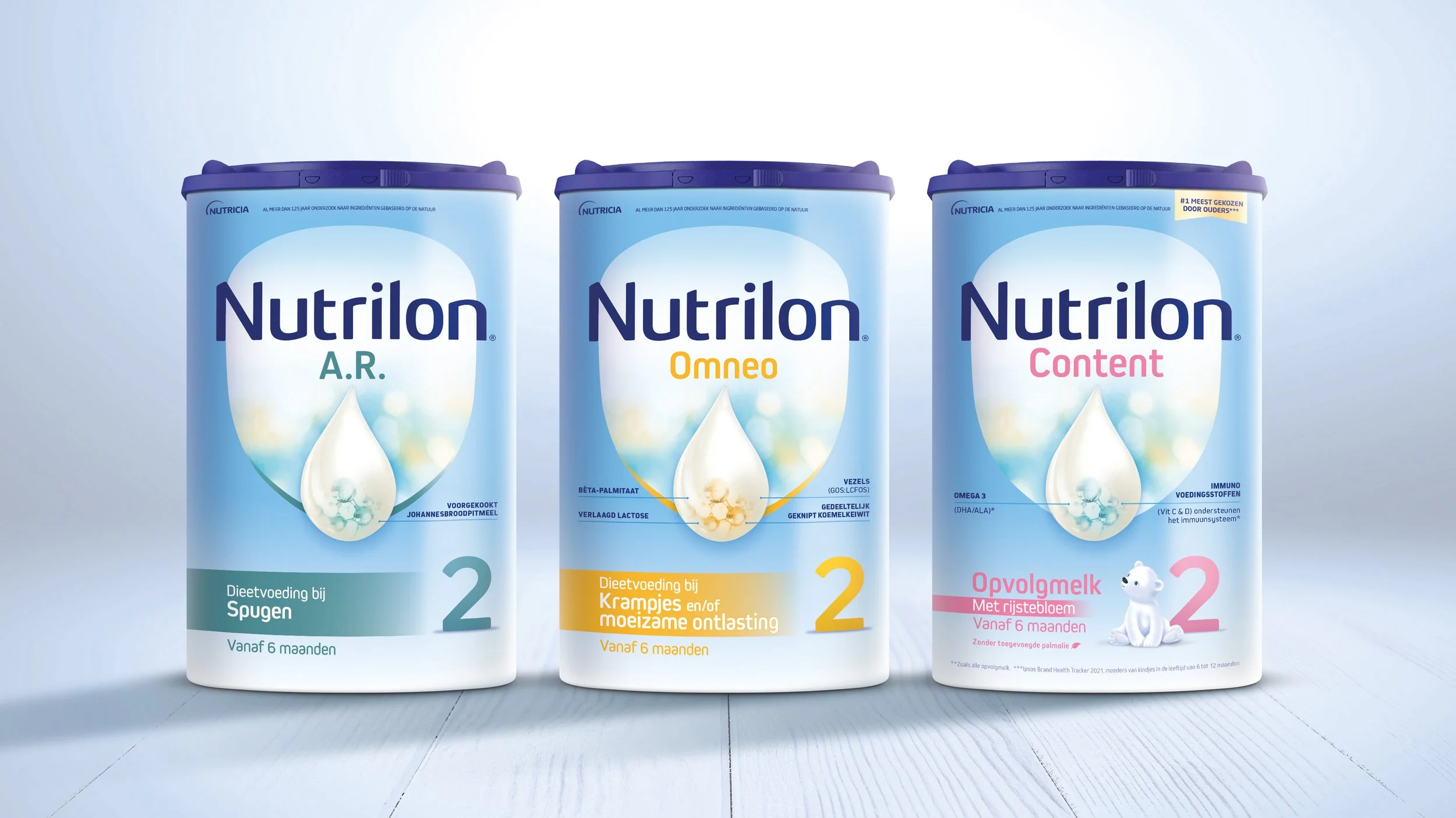
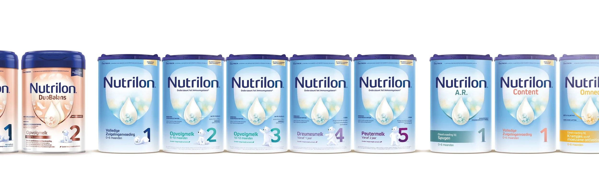
Retain Nutrilon's authority but reframe its scientific excellence in a more natural way, and create a range architecture with clear navigation across age stages, functional and premium sub-ranges, and a dynamic innovation pipeline.
What I designed
The shield as a lens, not a badge.
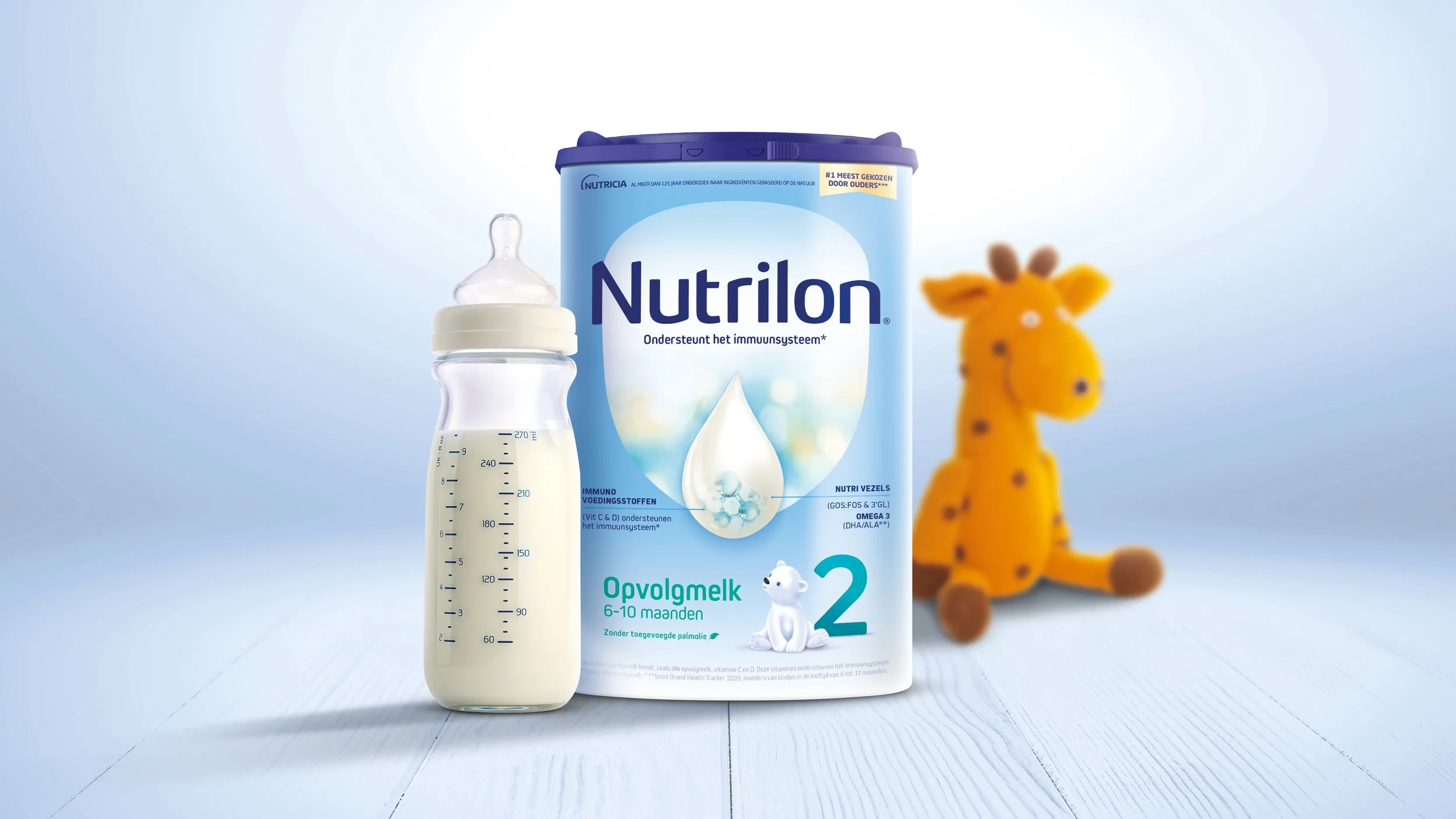
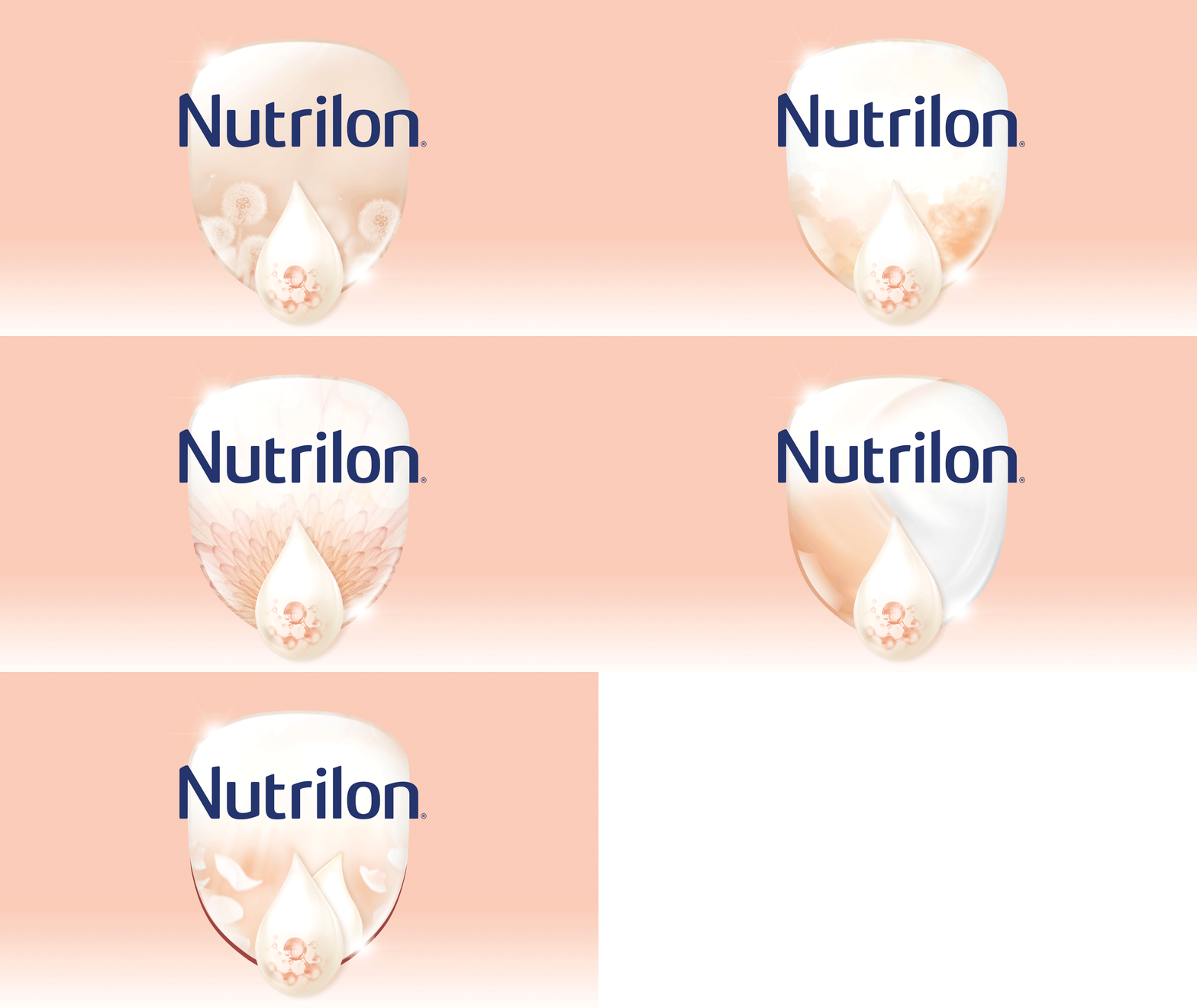
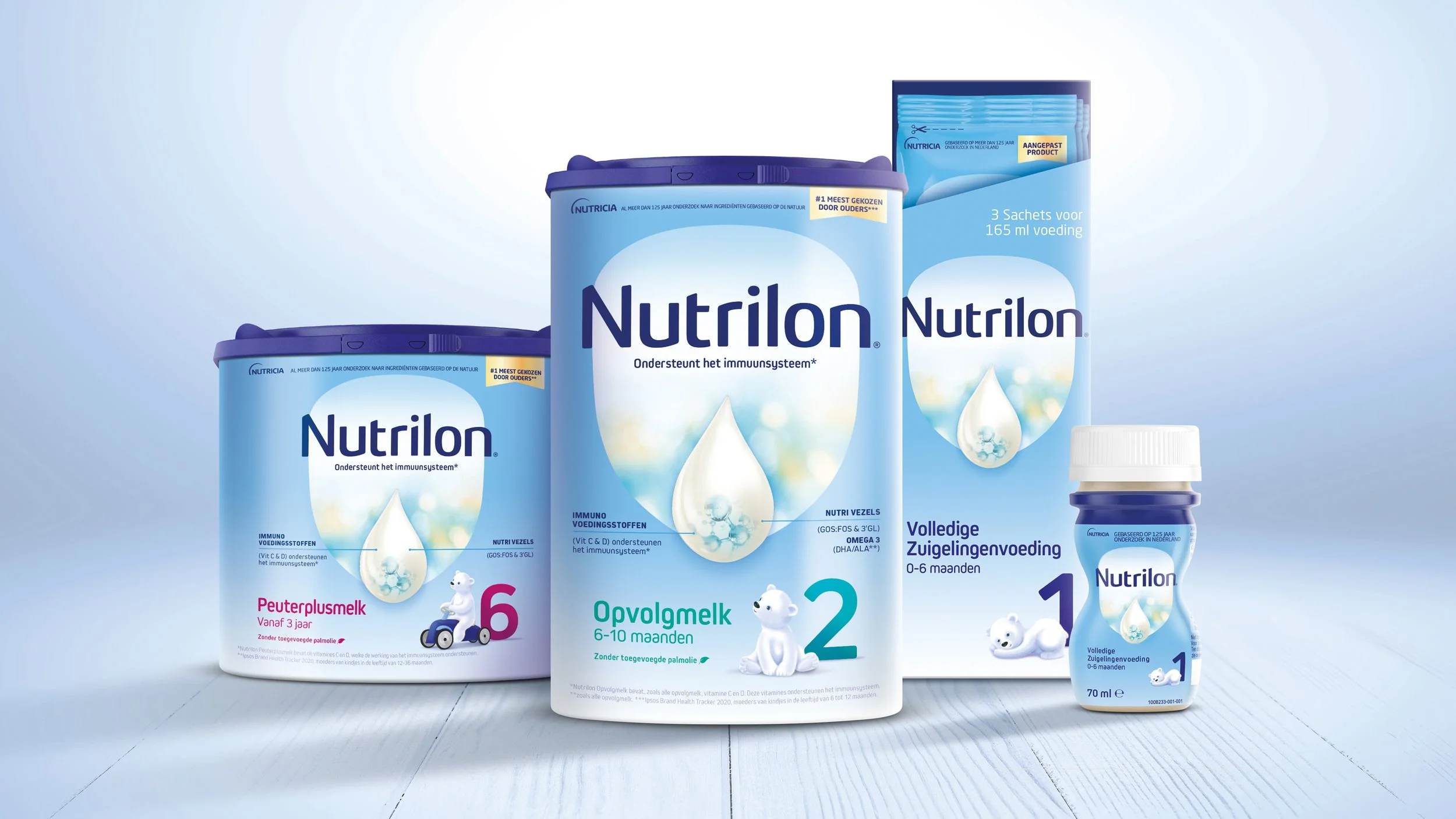
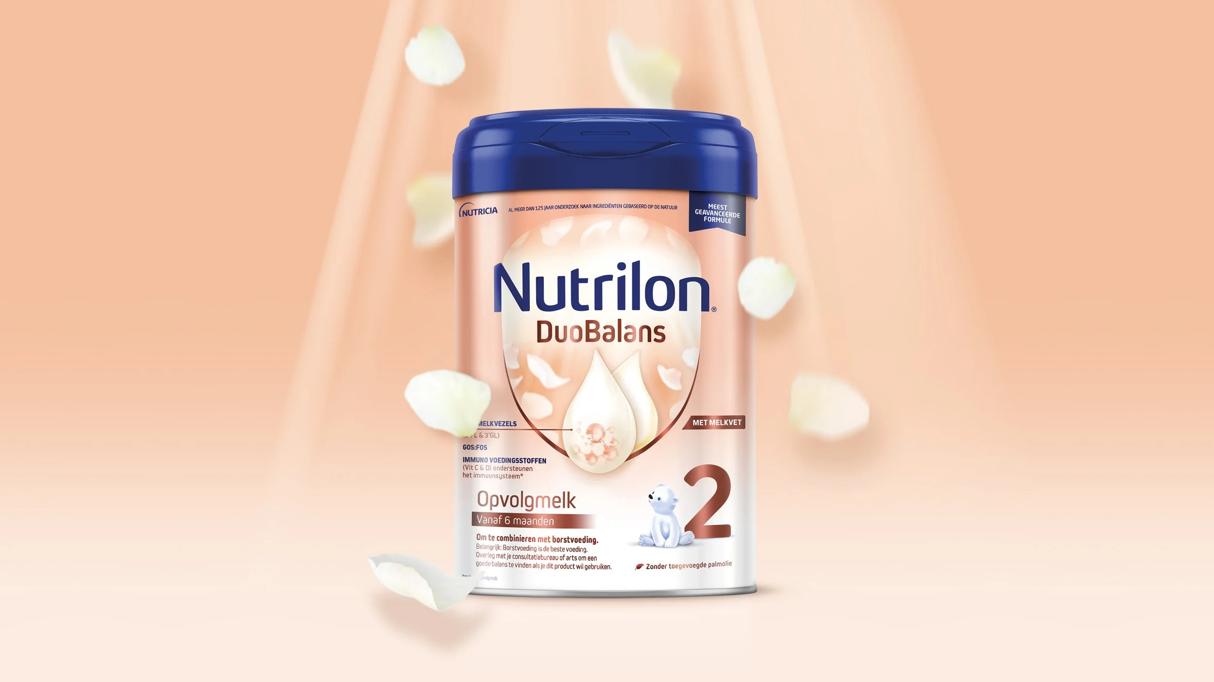
A new brandmark, refined typography, and a clean, calm, sophisticated pack architecture. The concept centres on Nutrilon's iconic shield: softening its edges for a more natural, organic feel and using it as a lens into nature as well as a holding device for the brandmark and droplet.
The texture inside the shield was inspired by dappled sunlight and the wonder of a baby's first look at the world. The architecture had to carry age stages, sub-ranges and new products without being redrawn each time.
Credits
Designed at Osborne Pike for Danone Nutrilon, April 2021
All content © Danone
Talk to me about brand.
christievgray@gmail.comSpeaking enquiries, collaborations, and conversations about the work.